Craft an inclusive and modern UX design for 她 Ta Zhi Dao, community in Taiwan, aligning with their mission of establishing safe spaces for women in Web3.
My Role and Responsibilities:
Lead UX designer, responsible for evolving the initial soft feminine design, collaborating with the team in Figma, implementing inclusivity changes, and finalizing the design.
Web3 is all about shaking things up by making the internet more decentralized and user-friendly. Imagine a digital space where you have more say and control over your online world. That’s what Web3 is aiming for. Now, tie that in with the mission of 她 Ta Zhi Dao – creating safe spaces for women in the Web3 industry. It’s not just about tech jargon; it’s about using the potential of Web3 to build a digital space that’s safe, supportive, and accessible for everyone, especially women navigating the Web3 world.
My Design Process
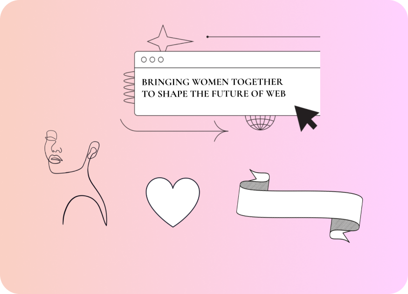
In the initial phase of the design process, I envisioned a user experience with a soft feminine aesthetic, characterized by gentle colors and elegant, minimalistic elements such as ribbons and hearts. I also experimented with different gradients and shades. The intent was to create a visually appealing and welcoming environment, resonating with traditional feminine design elements.
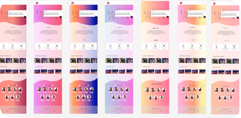
However, as the project progressed and through collaborative discussions during our calls, we decided to completely change the design direction. We collectively decided to embrace a more inclusive, empowering, and modern approach. This shift aimed to transcend stereotypical design norms and resonate with a broader audience, aligning with the values of 她 Ta Zhi Dao.
New Style Guide
We shifted gears in the design process, opting for a more modern look with bold visuals and inclusive colors. This change wasn’t just about aesthetics; it was about embodying the values of 她 Ta Zhi Dao. The final design reflects a space that’s not only visually appealing but also contemporary, empowering, and welcoming to everyone.
The Result
Impact:
Now, the platform isn’t just a visual upgrade; it’s a place for meaningful connections and shared experiences. It’s like giving users a friendly and inviting environment to explore, learn, and connect with each other, aligning with the goal of creating safe spaces within the digital world.
What I learned:
During this project, I understood how crucial it is to adapt and change. We started with a softer, more feminine design, but through collaboration, we decided to make it more empowering. It taught me that design isn’t just about making things look pretty; it’s about making users feel strong and confident. Recognizing this shift, I learned that design choices can influence how people feel and engage with a platform.